When we had to shoot film for slides of craftwork, framing was a big decision. You set up your art, turned on the lights, carefully framed the work and took your shot. The resulting slide was the final word on the craftwork. Then you made a few dozen copies of the slide, which were often off in contrast and color. Yet these were the slides you submitted to shows and hoped to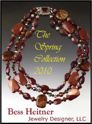 get them back undamaged.
Digital photography has totally changed the world. We live in a world of infinite copies and extraordinary distribution. It has given us the ability to take dozens of images of craft with no additional cost. And the paradigm shift here is that now it’s easy to take different photos of a work for different purposes.
Setting up
The photos here will help clarify how different uses call for different images of the same piece. The way I like to think about it is that the size of the image should match and make the most of the format it is presented in. To illustrate this, I’ve used a necklace by New York City jeweler Bess Heitner.
When photographing artwork with a digital camera, always set the camera to its largest settings (the largest image file size).You’ll want to save it as either a RAW file or as a low-compression JPEG. With this large file, you can prepare images for printing and then reduce the file sizes for other uses. If you shoot small files, you are stuck because you can’t digitally make them any bigger without losing a lot of quality.
Advertisement shots
A photo for a brochure, a magazine ad or any other print use can show more of the object than some other uses. I’ve made a mock ad for Heitner using a photo of the necklace. I shot the whole necklace and gave myself extra space to lay copy out on the image. Because this image will be printed and held in people’s hands, it will literally be looked into more deeply— you see more detail than you can with an image on a screen.
The photo above shows the necklace shot as a cover for a brochure or as a magazine advertisement. To begin, I shot the entire piece and left a lot of space around it to provide room for text.
To create a strong cover, I had to shoot the piece with the text placement in mind. In the past I’ve described three basic compositional forms that help make your photos visually stronger. When the photo is going to have text laid out over it, you need to consider the text as an element in the design and include it in the composition of the original photo. This way the text and image don’t fight each other.
Photographing work for jury submissions
For jury submission images, this “ad” shot won’t work. The space I left for the text is now wasted and makes the necklace too small in the frame. When I wanted to shoot the necklace for jury submission, I first rearranged it and then framed it tighter.
When shooting for jury submissions, there are a couple of concerns in the way images are viewed. To begin with, both digital projectors and computer monitors don’t automatically give the “right” colors. Most screens are too blue and too bright (these are the defaults) and even if you’ve tried as hard as you can to color correct your pictures, these screens won’t show them accurately. So if color is critical— as in glass pieces or fabrics—you have 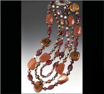 an uphill battle.
Secondly, there’s the issue of scale. Jury submissions are viewed at lots of sizes. Where slides were generally projected for jurors, digital images may be viewed in any number of ways. From big projected images to small notebook screens, the image viewing size is all over the map.
I try to shoot jury images with smaller screens in mind. If the image looks good on a small notebook screen, it should be fine on larger screens. To this end, I try to focus on detail and arrange the work so a single important element predominates. For jury submissions, I shot the necklace as a longer frame (see image).
Web images
Finally, there are images for sale sites like eBay. A visitor to these sites usually types in search key words and, after hitting the submit button, gets a page of anywhere from a dozen to several dozen tiny thumbnail images. These thumbnails appear on most monitor screens as images that are 1 inch by 1½ inch or smaller. 
Consider that even a well-done, well-lit image shot for an ad or for jury submission, when reduced to a tiny thumbnail, can look awful. Elements of background and lighting that “read” visually in large images may be confusing and distracting in these tiny images.
And that’s a problem. When your images are presented on “search results” pages, they are competing for the buyer’s attention with all of those other images. It’s not like the jury viewing where each image is given its moment. This is a rough-and-tumble world most reminiscent of a lively bazaar.
Being aware that these very small images have to grab the viewer’s attention influences the way I’ll shoot them. Small images require larger details and higher contrasts.
Rather than shoot on a graduated background or solid color, for sales sites like eBay I think that plain, old white works really well.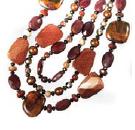 The reason for this is simply that the contrast of the object to a white background attracts the viewer’s eye. I try to emphasize an eye-catching detail. There’s no need for a shot that shows the whole piece, because the viewer has been searching by key word (for something like “necklaces”) and these are the results they got. If the search result is a whole page of full necklace thumbnails, the tight detail shot is going to jump out.
This means your work will catch the viewer’s interest and be clicked on—hopefully this will take them to your website and lead to sales.
Being able to photograph your work differently for different uses is one of the benefits that digital photography has brought us.
Remember how with film you tried to get a single great slide for many purposes? Remember how you had to get duplicates slides that were close to the original but never exact copies? Well, digital photography has freed us from all of that. Now you can shoot an object several ways and make an infinite number of exact copies to use for multiple purposes at no extra cost.
This article is reprinted from the July 2010 issue of The Crafts Report. If you would like to order this issue, Call Jack at (800)331-0038 ext. 124