By Laura Fitch
Stickeryou.com
Instagram is used by 1 billion people every month. Yes, you read that right. 500 million people log on every single day. That means that giving users something to snap in your space can be a huge boost to your business.
It may seem like you’ve got to shell out big money to make your store, pop-up or booth Instagram-worthy. But don’t worry. With a little creativity and some thought to the design, there are lots of ways to make your space ‘grammable on a budget.
Here are a few ideas:
Create an experience
People want to share photos and videos of experiences more than things. Luckily, as a handmade business owner, you’ve got a huge competitive advantage here.
At your booth, pop-up or store, you could spend a couple hours a day actually making some of the product right there in the store or in the window: arranging flowers, dipping candles, building your product. This stuff is Instagram gold. Not only is it visual, but it allows your customers to pull back the curtain and get a really authentic sense of all that goes into the work you do. Those authentic moments are the exact kind of content that people are looking to share on Insta.
Pick a theme colour
Choose a colour that dominates the space and really makes it pop. Your products should complement this colour and stick closely with the theme. Here are some examples:
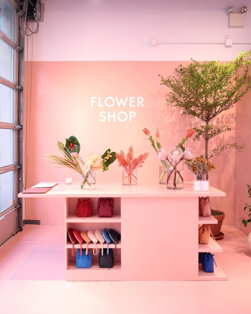
The Mansur Gavriel leather goods store in NYC has gone all-in on pinks on this wall – the pink is amazing on its own, and it also really complements its beautiful bags. This is a setup that people love to take photos of.
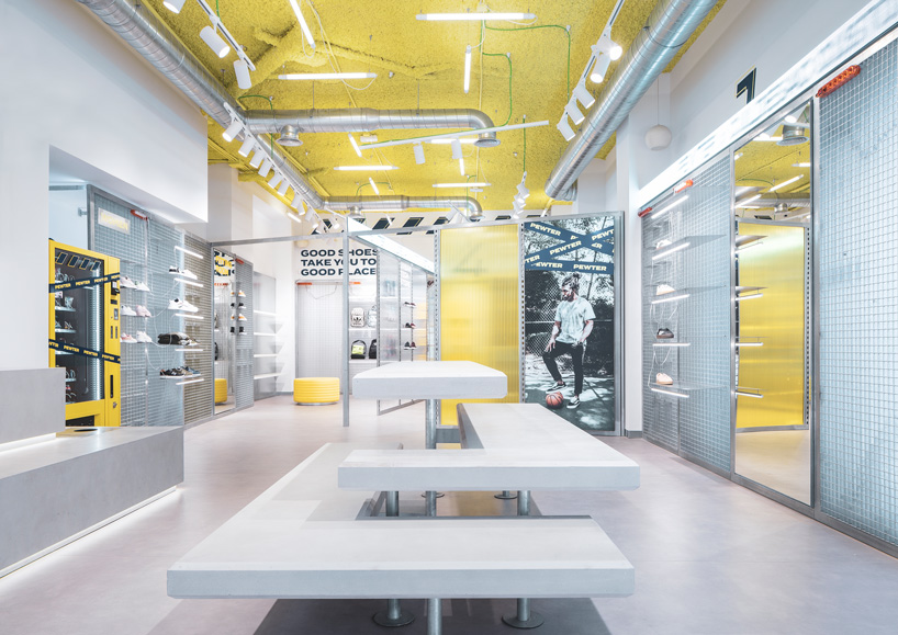
Yellow accents and neon lights dominate the Pewter sportswear store in Gandia, Spain:
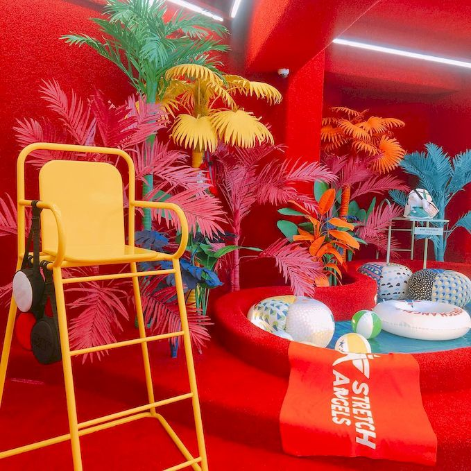
This room at the two-storey Stretch Angels fashion store in Seoul, Korea is dominated by a red that you can’t take your eyes off:
Create patterns
Consider making space on one wall that has a cool background for selfies. A great budget option is patterned wallpaper, custom wall decal, or a fun or inspirational phrase painted on the wall or drawn in chalk.
If you do this, make sure to put your shop’s Instagram handle somewhere on the wall so that it makes its way into those selfies, and when you see people snapping photos on your selfie wall, give them your card and suggest they tag you in their pics.
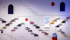
You could also creatively arrange your own products on the wall so that they become the pattern that people want to snap. For example, FILA made a pop-up store in SoHo and arranged its shoes on the wall in a way that made it into the decoration everyone wanted to take photos of:
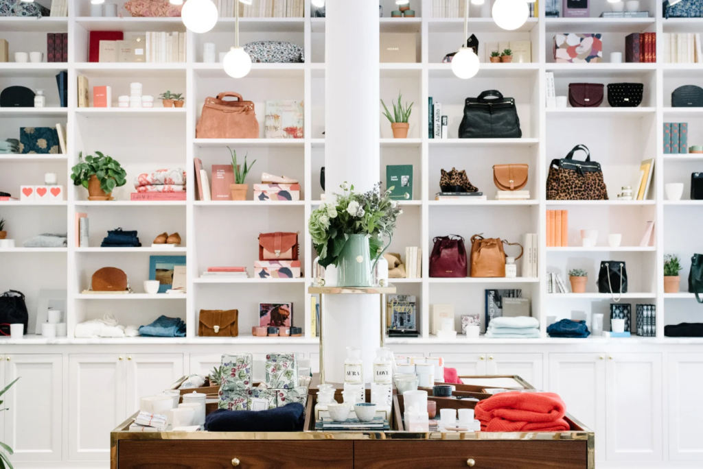
Another way you can create patterning with your product is by carefully arranging it on tiny shelves, like this Sezane store in New York:
Fun phrases
Whether it’s earnest and feel-good or tongue-in-cheek, Instagram never tires of a great message. Get creative with how you display phrases throughout your space:
- On chalk boards outside and inside your space
- On decals on the floor and walls
- On your selfie wall
- On your packaging itself with custom labels or custom stickers.
It’s always great if you can work fun Instagrammable phrases into your product itself, so that your beautiful goods work their way into people’s feeds.
Work your branding in
It always bears repeating: make sure your branding gets into those Insta photos wherever possible. This does NOT mean you want to plaster your logo all over the place. If you’ve got a distinctive logo, font, and colour scheme that defines your branding, hopefully your aesthetic will speak for itself. But do make sure that your fun selfie wall and cheeky phrases include your brand or your Instagram handle so that your brand will be unforgettable.


