By Laura Fitch
Stickeryou.com
You’ve put in the painstaking time to develop your skills. You’ve wowed your friends and family with your talent. And you’ve finally built up the courage to take the plunge and turn your craft from a hobby into a money-maker. Congrats. You’ve done the hardest part. Now, before you get your creations out into the world, there’s one thing you’ll want to get right: your logo.
Your logo is the first impression many people will have of your business. When done right, it instantly transmits a message in line with your product and values. When done wrong, it’s the only thing people will pay attention to – meaning customers may never even give your carefully-crafted product a chance.
If you have the funds, hiring a professional is a great choice. But if, like many small business owners, you don’t have that kind of cash right now, don’t worry. Here are some principles to keep in mind that will help you design your own logo like a pro:
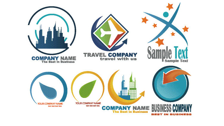
Know What’s Out There
Go online and look at the design of every handmade business you admire — and even some you don’t. Take notes. What you do you like? What don’t you like? How big is the text? What color palettes are they using? What’s the feel of each? This is a chance to get inspired. The more you jot down, the more you’ll get a feel for the visuals that you want to represent your own brand.
This will also give you a feel for what has already been done — and what hasn’t. That will help you define your niche and make a logo that you know will stand out from the pack.
Keep It Simple
It’s tempting to get really intricate here, but avoid that urge. If a design is too complex, the visuals can become overwhelming, which can be a turn-off to potential customers. Unless you have a background in graphics, it’s best to leave really complicated design to professionals. If you’re DIYing it, you’ll want to keep it clean, simple and focused. There are a lot of templates online that can help guide you through this process and give you a grasp of the basic design concepts that will help your logo pop.
Don’t Overdo It On the Fonts
Many handmade business owners make this basic error when creating their own logos: they mix too many fonts together in an attempt to add interest to their design. Instead, the fonts clash with each other, and distract potential customers’ eyes from where you want them: on your carefully-crafted handmade goods.
Again, simplicity is key here. Choose one font family that will define your brand, and play with the size, color and weight of the text. This will allow you to create interest and variety while still maintaining cohesion in the design.
Define Your Color Palette
A great color scheme is crucial to the look of a logo, but eyeballing the combinations that really work is one of the toughest parts of graphic design. Luckily, the internet has a ton of easy tools to help you out here, and some companies offer graphic design services with branding product purchases such as stickers or labels. Your best bet is to zero in on one color that really captures the spirit of your brand, and then use an online color palette generator to discover other colors that will complement that anchor color. Using one of these tools is actually a really fun way to develop the color scheme that will define your logo – and it may give you ideas for other parts of your brand’s identity, from labels to t-shirts and merch.
Getting your logo right can take time, but if you keep these principles in mind, it doesn’t have to be overwhelming. If you design your logo well, it could be the factor that takes your business to the next level.


