by Patrice Lewis
A critical but unexamined aspect of successful sales at a craft show is the design and layout of your booth. Don’t think all you need to do is set up a couple of tables, put your craft item on top, and then sit back and wait for sales to roll in. Believe me, the design and display of your products can literally make the difference between excellent and abysmal sales.
The Basics
We’ll start with the basics—things that should go without saying but are often ignored.
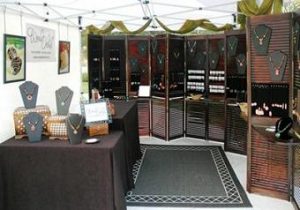
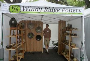
Neatness is a huge factor in a customer’s perception of your booth. Tables should have skirts hanging to the ground so extra stock or other untidy items can be hidden away, not blatantly left in plain sight. Keep boxes, hand trucks, electric cords, half-eaten sandwiches, and other detritus out of sight. No one likes to browse among slop.
Crowding is another factor. When shelves or tabletops are crammed so full that customers can’t take it all in at once, this can intimidate them because often customers don’t like to “linger” in a booth unless they see an item they like. However, there is a balance to this— booths that have only a few sample products on display may seem stingy. Keep your displays full but not crammed.
Consider grouping different products so a healthy representation is visible. Perhaps you have widgets on this display, frammerjammits over there, and whatnots on shelves behind you.
Do whatever it takes to make your booth warm and welcoming—not cold and hostile. Look around at other booths and see what appeals to you and what doesn’t. Something that turns you off will likely turn off others as well.
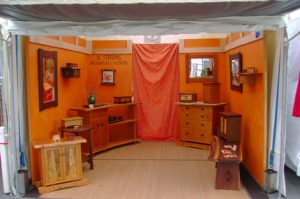
Consider cozy or inviting touches. I recall one indoor craft booth in which the seller had brought a small carpet, a floor lamp and a rocking chair for the vendor to sit in, which instantly transformed her booth into an inviting living room. Very clever.
Product Displays
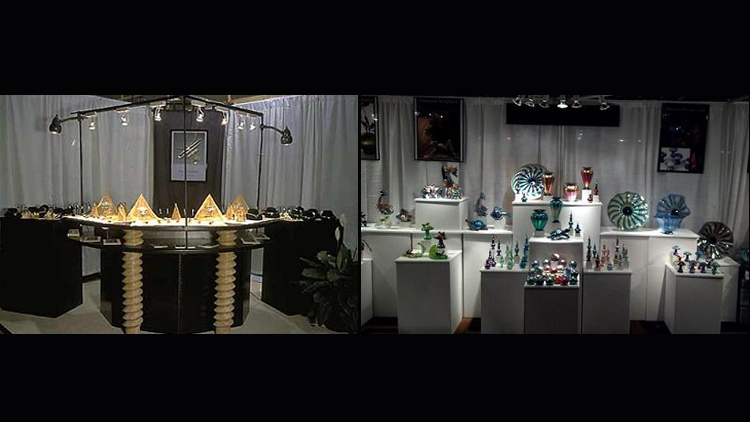
It’s difficult to discuss displays because every product is different. Some items, such as jewelry, need to be behind glass with bright lights shining on them. Some items need to be dangled from above. Some items need to be displayed on flat tabletops.
But in every case, the key ingredient is visibility. It may seem obvious, but if the customer doesn’t see the product, and see it quickly, then it doesn’t exist.
Consider the power of a vertical display. Items displayed where the eye can sweep over them at a glance—and see the entire selection—are far more likely to result in higher sales. If you can hang a sampling of your product so they spin and twirl and catch the eye, then do so. Moving parts always get attention.
We have a wholesale customer who was doing his first show selling our tankards. He had lousy sales—so lousy he had no plans to buy any further products from us—until some wise neighboring vendor told him to stop displaying the tankards on a flat tabletop where customers could only see a few pieces at a time. Instead, she told him to display the tankards vertically, and to display everything he had on hand (about 90 pieces).
Our wholesale customer literally sold out of tankards. He called us right after the show and ordered another hundred pieces.
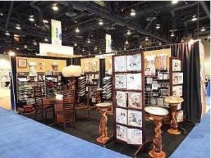
This leads to another important selling concept: Keep your shelves full. It’s a strange element of show psychology, but customers who see half-empty shelves are not impressed by how well your product has been selling. Instead, they will glance at your nearly vacant display, and walk on. It doesn’t matter how many pieces you still have on display. Half-empty shelves equal “no selection” in the eyes of a potential customer.
Restock immediately. If you sell one piece, replace it with another piece. If you run out of replacement stock, then either reduce the number of shelving or display units, or have something on hand to act as a “filler” for empty displays (silk flowers, driftwood, etc.; anything is better than nothing).
Smart vendors at farmers markets, for instance, will not display their apples in half-empty baskets. Instead, as the apples sell, they’ll heap the remaining fruit in smaller and smaller baskets to make the baskets appear full and overflowing. Use this idea in your booth as well.
Bring your product forward
The less the distance your customer has to travel into your booth, the better. This distance can be improved by designing your booth to appear airy and open. You don’t want to give a browser the impression of going into a cave to look at your wares.
When we first started doing retail shows, we had an enclosed easy-up type booth and we placed our shelving units along the interior sides and rear of the booth, forming a cave. Needless to say, we only attracted spelunkers. Bringing our shelving units out toward the front of the booth cost us space but improved sales.
The bling-bling factor
Another seemingly obvious ploy is to make your booth as eye-catching as you can within the bounds of good taste. It took us a while to catch on to this.
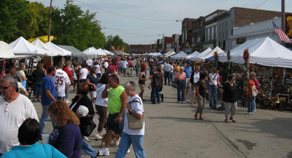
One of the biggest shows we ever did was one of our biggest financial disasters. It was a huge indoor holiday food and gift festival in a big city with nearly 500 booths. We were used to doing small outdoor shows—big mistake.
All the other vendors had the good sense to doll up their booths with as much glitz and glamour as possible to draw the customers’ eyes. We didn’t have glittery backdrops or shiny tablecloths or splashy signs or anything except plain wooden shelving units filled with plain wooden tankards. We were lost amid a sea of electronically accented bling-bling. We couldn’t compete. People walked past us and never noticed we were there.
So do what you can to draw the eye and appeal to the senses (Most of the time, this does not include playing music. You will only annoy your neighboring vendors.) Suitable signage, attractive tablecloths, appropriate lighting, homey touches, shiny tabletop accents, and dangling displays, etc. are all examples of how you might improve your visibility.
Vendor behavior
Even such seemingly minor things as where you sit in your booth can effect sales. This sure doesn’t sound like a big deal, does it? Well, think again.
Early on in our business, we displayed our tankards on four shelving units arranged in a shallow arc at the back of the booth (the “cave” effect). We then sat on chairs at either end of the arc, happily awaiting customers that seldom came. At last we got it: People were too intimidated to enter the booth with the two of us arranged at the opening, like vultures waiting to pounce.
We removed our chairs to sit behind the shelving units, moved the shelves closer to the front, and never had trouble again with welcoming customers into our booth.
Here’s another point that sounds trivial, but like most things at a craft show, it’s not: Remove all excess chairs. Seriously.
An empty chair is an invitation for a talkative browser to sit down uninvited and regale you with a 30-minute account of Great-aunt Helga’s gallbladder surgery. (I don’t know why they think we’d be interested, but it never fails to happen.)
So if you have extra chairs, fold them up and stash them in back until you need them. If your booth partner takes a lunch or bathroom break, fold up his chair and tuck it out of sight until he returns.
Oh, and another problem for some vendors: Shut up. Really.
My husband and I were vending at a craft fair one time when I decided to take a break and walk around to see some of the other displays. I stepped into a booth selling an attractive product…and there I stayed for 45 minutes because the overly friendly vendor talked and talked. He was one of those people who, whenever I glanced at my watch and said I really had to go, just didn’t get it. No, he had to tell me every single detail of his job history, his wife’s job history, and his year-old daughter’s developmental milestones.
Don’t do this to a customer, because I can assure you your sales will suffer as a result. Customers are not your best friends who have come to hear your life story. They are there to look over your products. Let them.
Of course, silence can be equally as bad. A friendly “hello” and an offer to answer questions are important too. The secret is to find the balance.
Experience
Booth layout and vendor behavior are things that will improve with experience. After every show, examine what you could do better and then make the necessary changes before the next show. Learn from mistakes. Garner wisdom from successful vendors. Ask for feedback from neighboring craftspeople.
With time, you’ll become the sort of successful vendor from whom other craftspeople will seek advice.
Patrice Lewis is a wife, mother, homesteader, homeschooler, author, blogger, columnist, and speaker. An advocate of simple living and self-sufficiency, she has practiced and written about self-reliance and preparedness for almost 30 years. She is experienced in homestead animal husbandry and small-scale dairy production, food preservation and canning, country relocation, home-based businesses, homeschooling, personal money management, and food self-sufficiency. She and her husband have been married since 1990 and have two daughters.

