Thank you to everyone who applied for the chance to have your booth made over. Though their were many entries, I could only choose one. Some of yours were actually too good and didn’t warrant the changes you desire!
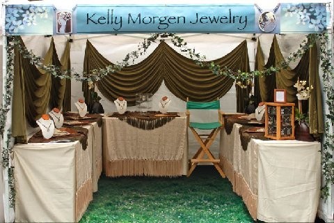
 I chose Kelly Morgan Jewelry for this year’s booth makeover for many reasons. One is that Morgan’s jewelry is wonderful! You can see the skill with which it has been crafted, and she has a great sense of design and a strong artist’s identity. She uses fine materials and brings them together with style and flair. On the other hand, her booth is also a work of art, but it is not showing her work to its best advantage. I am sure if Morgan were to change her booth to incorporate my suggestions, she would see a dramatic increase in sales. I believe even though this is a jewelry booth, there are so many things to learn from this display that would help artists from all mediums.
The booth is attractive, and I am sure she gets many compliments on it. There is the conundrum! How can a booth that people compliment all the time be laden with bad choices? Artists can actually become dependent on the comments that customers make about their booth and see these comments as a good thing. I will assure you that any compliment a customer gives you as an exhibitor feels good but the compliments should be about your work and not about your display. If customers are noticing your display then they are looking at the wrong thing and sales will suffer as a result. The booth is neat and tidy for sure, but there are so many distractions taking away from the visual appeal of her jewelry that the jewelry has taken a back seat to her interior design.
I believe this booth is over designed and over draped, layered, fringed and vined. Some would love this booth but then again they would be noticing the booth. For many customers it may be too much—overly complicated and fussy. We are in an era of new simplicity and simple elegance. Though Morgan’s booth is elegant, it is far from simple. More and more customers are moving away from the more is more look in their environments, and if the customer does not relate to your booth they will not relate to the work. When you look at Morgan’s booth you will notice a lot of detail in the draping and the fringe and layers of the table covering. What you notice is fabric, the last thing your customers should be looking at. What they should notice first and foremost is her lovely jewelry! The jewelry has been upstage by the display and it should be the first thing a customer notices. Look hard at this photo, and you will see the jewelry is barely noticeable, especially, the intricate details and her ability to draw and translate these drawings to metal. This is what gives her jewelry its punch but that is lost because it is dominated by her display.
Here are some suggestions I would make to improve Morgan’s booth to showcase her jewelry and to improve her sales.
1. First, this booth needs a floor covering; booths without some type of floor treatment just don’t look finished. It doesn’t have to be expensive or heavy: foam flooring gives a great finish to a booth and works both inside and outside. It is lightweight, affordable and easy to clean.
2. The branding banner that goes across the front of the Morgan’s booth either needs to be moved to the back wall of the booth or repeated again on the back wall. Customers don’t necessarily care about who you are and where you are from, until they have engaged in your art. Once they do, they want to look up and find your branding statement. I do think this branding sign is a good look for her line and this banner does more to show her jewelry from the aisle than any other element in the booth.
3. The vine in front of the booth should be removed, as it distracts from her jewelry. The way this vine is hung, a customer must enter only in the middle of the booth or it makes it necessary for a customer to duck under it. Artificial flowers or greenery should always be avoided for art and craft shows. The nature of art dictates the use of real flowers (of an unusual or artistic choice). Ordinary flowers can make your work look ordinary. Some booths can use accessories and they work great, other booths the accessories become more of a distraction then an attraction.
4. The most distracting element of the display is far and away is the deep olive colored fabric panels suspended on the walls. I believe this is what a potential customer notices first and I don’t feel it is the right look for her product line. Her work is rich and details and it needs no distractions in the form of pleated, textured or fringed fabric. A smooth, (wrinkle free) flat (not patterned), neutral background, (in just the right color) would make her jewelry pop.
5. Overall the look of the booth is very polarizing. Some would love it some would not like it at all. You need a look for your merchandising that is more universally appealing. Her jewelry is not polarizing, it is very appealing and therefore the merchandising must match the merchandise and be more harmonious.
So far we have only addressed the elements of the display. Now let’s consider ways to actually display the jewelry so it has maximum impact.
1. One of the most striking things about this display is how even though her table heights are higher than the norm. Morgan’s jewelry is still displayed too low. There is nothing like displaying art at eye level. (Jewelry and small items especially) One reason is that eyelevel is where you actually see jewelry on a person, and the customer doesn’t have to bend over to appreciate it. To accomplish this I would suggest wall cases. Very few artists use wall cases but those who do realize the power of this visual merchandising technique. Necklaces and earrings sell best from a wall case, while rings and bracelets can be displayed on the bottom of a wall case or on a glass shelf in the case. NOTE: If you use a wall case to display your jewelry or other small precious objects, make sure the case is accessed with split glass. Meaning that half of the glass slides to the right and half to the left. In this way it doesn’t require floor space to access the case. In other words if your cases are accessed by a hinged door to open the case it swings out into the foot print of your booth and to open a hinged door customers will need to back away from the case in order for you to swing the door open. This is particularly difficult if the show is crowded and your booth is busy. I would suggest putting wall cases on both the right and left sides of her booth, near the aisle to attract customers in as they walk by. I would use much or the entire back wall to show models (of different age demographics) wearing her jewelry and large individual blow-ups of her lovely pieces to further draw customers in.
2. I would remove all neck forms in the booth and find better ways to display these necklaces. Neck-forms are the most over used of all jewelry display techniques. Customers get so anesthetized by neck-forms that they don’t even look at the jewelry on them having experienced them in just about every jewelry booth they come to. Find new and exciting ways to show your necklaces and break the mould. Leave the neck-forms behind and sell more jewelry as a result.
3. Morgan’s small counter cases: The clear one on the center back table and wooden one on the right side of the booth, (low and crowded) do not project the ambiance and price point of her jewelry. Consistency in your merchandising elements are always best in a booth, the more your merchandising echoes your art, the more upscale your overall presentation appears.
4. A large mirror or two (for when you are really busy) are conspicuously absent from Morgan booth display. A mirror sends the message “try it on!” People will try on more wearable products if a mirror is visible, especially if they see other customers trying things on. Get a good mirror of an appropriate size and quality and you will find it pays for itself the first day you us it.
Speaking with Morgan about her booth, she was considering moving her displays to the aisle and not letting customers come into her booth. I think that this move would be a mistake. In the current economic slump that we are experiencing, people who have money to spend are shy about doing so. If you don’t give them a semi private place to spend money they might not!
I am not aware if this is a shot that Morgan ever used as a booth shot for a jury. But if it were to be used as a booth shot, the chair should be removed from the image. Chairs always send the wrong message to a jury. I believe it is better to avoid having any chairs in your booth shot. If you leave the chair at home at any show, your sales will go up. When you are sitting in a chair at a show, you are sending a lot of negative messages to your potential customers. It is a proven fact that if you are up and standing in your booth and moving about, more people will enter and more customers will buy your art.
There are no doubts that a toned-down booth, that deemphasized the booth itself and ramps up the work in that booth will increase your sales. You will know when you are on the right track when people stop commenting on your display and start commenting on your art.
Thanks to Morgan for taking the time to send in her booth images. I will look forward to hearing how her sales improve after she has made some of these changes.
or e-mail Kelly.Morgan@gmail.com.

